
Why Might You Join a Running Club?
Introduction
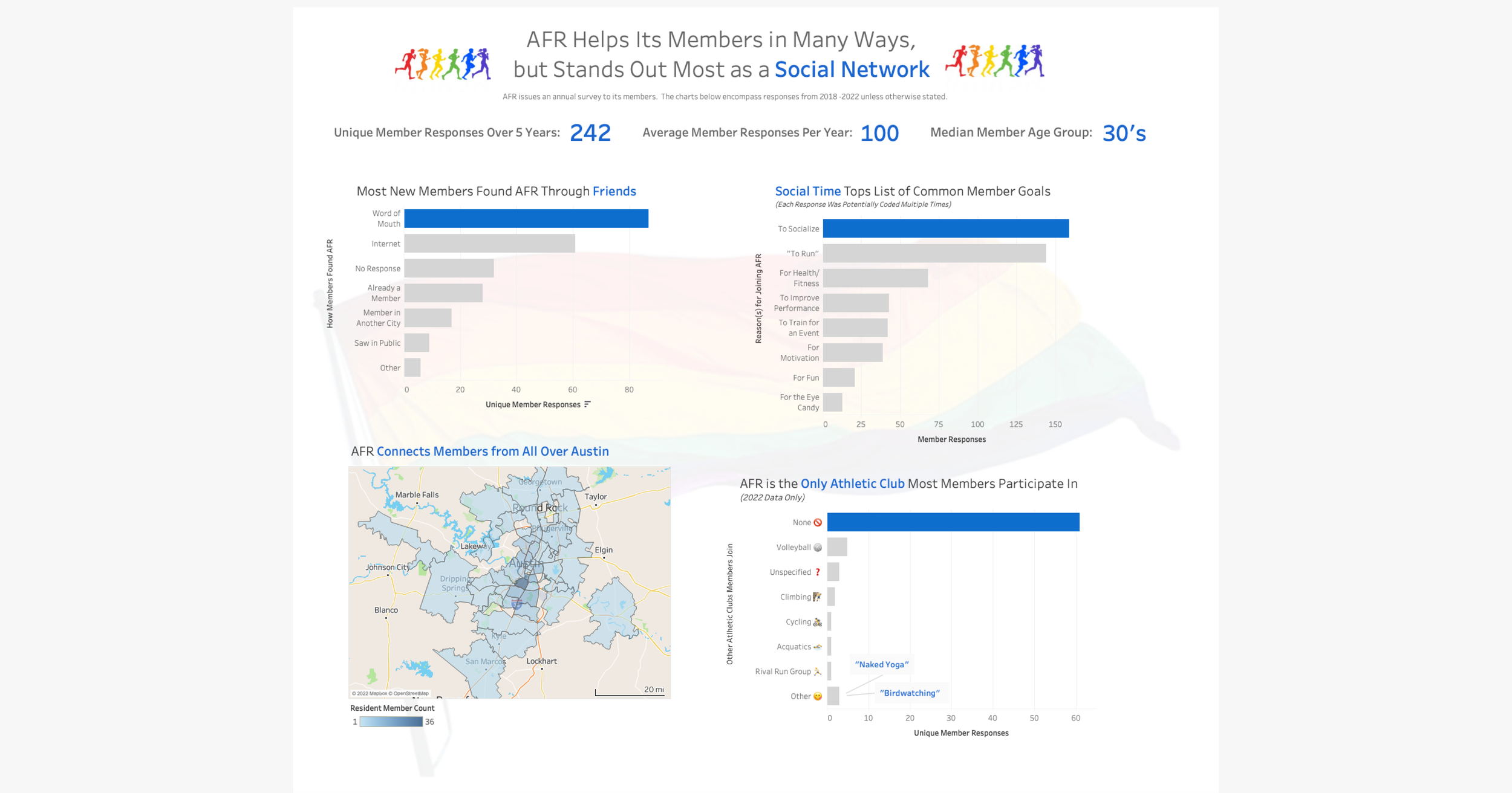
The ‘Austin Front Runners’ is an LGBT+ friendly organization based in Texas’ capital city. In 2022, the group asked me to help analyze their existing survey data for clues on how to increase recruitment and diversify membership.
Watch This Video!
(It summarizes the project).
0:00 - Introduction
0:21 - Dataset
1:01 - Takeaways
2:45 - Recommendations
Tell Me More…
I created the dashboard visualization using Tableau. Though the data came directly from the Austin Front Runners, the choice of what to display (and the analysis of what the club might do) is my own.
About the Project
Client
The Austin Front Runners
Timeline
4 Weeks
Goal
Utilize survey data to uncover trends in member preferences and motivation
My Role
Graduate Data Researcher with the University of Texas iSchool
Advisor
Andrea Cato
My Responsibilities
Analyzed Data
Extracted relevant insights
Created data visualization
Presented to Client
Primary Objectives
Display data to the Austin Front Runners (AFR) board in a manner that is logical, easily decipherable, and inspiring
Generate data-driven recommendations for improving the turnout at AFR’s recruitment process.
The Dashboard
My Process
-

1. Data Analysis
-

2. Display Choices
-

3. Dashboard Creation
-

4. Proposal Generation
-

5. Presentation
Data Analysis
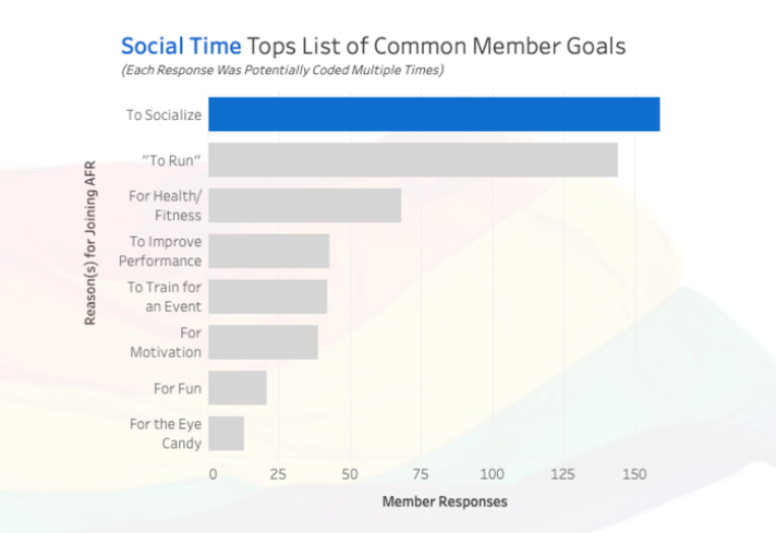
One of my initial hypothesis was that most people joined a running club for the athletic motivation. But the more I parsed through the data, the more I realized this interpretation was incorrect. The trend that emerged from the data was that AFR operated as a social organization first, and a running organization second.
Display Choices
I wanted to convey my findings through simple and varied examples. Since the data was mostly qualitative, and since the codes I had used didn’t make sense out of context, I utilized graph titles to convey the gist of what I had discovered. I also chose to color-code key terms with key data points in order to draw the connection visually for my audience.
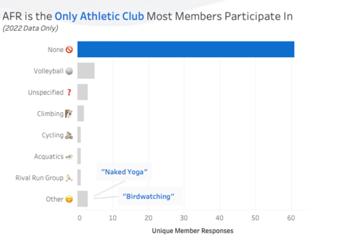
AFR has a great sense of humor, so I incorporated some of the cheekier member responses into my dashboard to increase the board’s engagement.
Dashboard Creation
As a relatively new Tableau user, this project represented a step up in complexity. I drew upon many resources to teach myself to create an effective visual, including Tableau’s own tutorials, third party help documentation, and my peers. In the process, I experimented with choices that didn’t make the final cut.

Proposal Generation
How might AFR utilize my findings? As I thought about it, I realized that social organizations need to recruit differently than activity-based organizations. Since the height of one’s social activity often comes in college, I found myself thinking of the student organizations I had been a part of as a potential model for AFR’s recruitment.
Presentation
I knew that visuals would tell a more effective story than words (hence the dashboard!), but I also wanted a format that would give the audience context around my process and recommendations. I chose a video format as the most concise and engaging way to tell this story, and used visuals throughout to enhance (but not replace) my explanations.
Watch the video by scrolling to the top of this page!